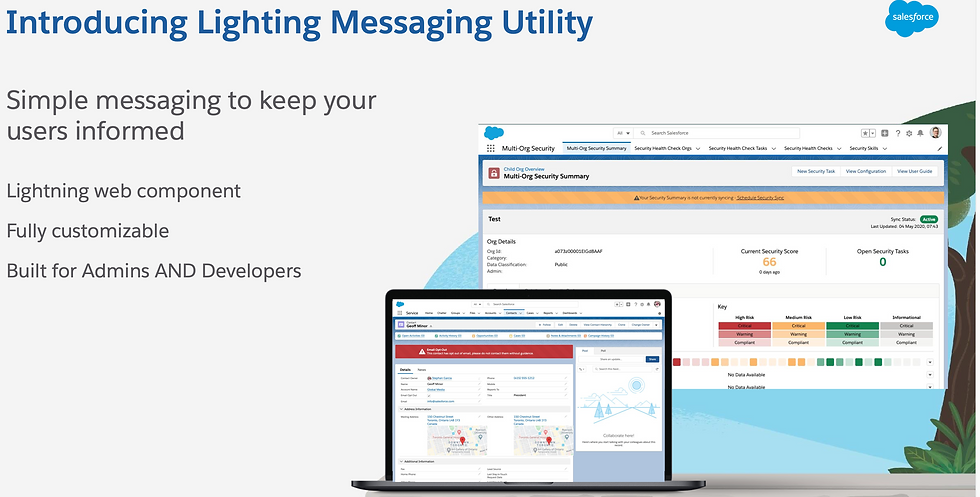
Free Things I Always Install: Lightning Messaging Utility
- Michael Kolodner
- Jul 19, 2023
- 3 min read

This is the first in a summer series of posts about free utilities I always install when setting up a new Salesforce instance or that I install into existing instances once I come along to support it. I love free things! (These, by the way, are all free-like-a-beer.)
First on the list (though it’s in no particular order) is the Lightning Messaging Utility from Salesforce Labs.

“What’s Salesforce Labs?” you ask? To quote the AppExchange listing:
Salesforce Labs is a program that lets salesforce.com engineers, professional services staff & other employees share AppExchange apps they've created with the customer community. Inspired by employees' work with customers of all sizes and industries, these apps range from simple utilities to entire vertical solutions. Salesforce Labs apps are free to use, but are not official salesforce.com products, and should be considered community projects - these apps are not officially tested or documented.
Basically these are free apps that someone at Salesforce developed for a demo or in their spare time and they’re releasing them for us to use. That’s pretty cool! Labs is also the program that publishes Open Source Commons apps like DLRS. There are dozens of other tools out there released under the Labs program. I encourage you to try them out—and let me know if you find something amazing!
This is a simple app that does one thing and just makes it easy: LMU allows you to display messages on your Lightning pages that fit the Salesforce Lightning Design System and, therefore, look like they belong.
I think it’s great that you can insert a rich text component onto a Lightning page and use it to display a message to your users. And you know I do it with emoji all the time! Or you can use a screen flow component and dynamically generate all kinds of informational messages, even if you aren’t using the flow for interactive screens. But when those are on the page they don’t quite look like the rest of Salesforce.

I’m sure I could work at it to make these look a little closer to the rest of the page if I really understood graphic design principles. But I know it would still be just a little “off” no matter how much time I put into it. Depending on the use case, that might be OK. But often I want a simple message that should blend seamlessly into the rest of the design. It just makes things look more professional. That’s where Lightning Messaging Utility comes in.
Here’s an LMU flag indicating they’re a current board member:

Or a mentor

Much better than Rich Text, right?
Here’s a reminder for opportunities that don’t (yet) have products added.

Sometimes you want to make it clear this was a major gift:

Those examples are just taking advantage of LMU’s color options and the Lightning App Builder’s native conditional display of components.

The possibilities are endless!
Other Tricks
One nice thing LMU can do that it’s very hard to do otherwise is display a pop-up window (a “toast” message). There are few ways to build pop-ups in Salesforce and sometimes you just wish you could force your users to pay attention. (Use sparingly.)
LMU can also insert icons from the Lightning Design System. That gives you additional options beyond emoji, not to mention that those options all share the look and feel of the rest of Salesforce. Or you can mix and match emoji and SLDS icons, of course.

How To
LMU is free, so you’re going to get what you pay for. In LMU’s case the downside is documentation: You get a slide deck. That’s not ideal, so you might need to do a bit of futzing around. But this is a simple tool, you’ll figure it out!

